Sử dụng bố cục trang Flexbox trong CSS
- Thứ ba - 22/04/2025 22:26
- In ra
- Đóng cửa sổ này
Flexbox CSS là gì? Display flex chỉ là một trong số thuộc tính của flexbox CSS. Hãy cùng nhau tìm hiểu kỹ hơn về cách sử dụng bố cục flexbox trong CSS nhé!
CSS Flexbox, viết tắt của mô-đun Flexible Box Layout, là một công cụ bố cục mạnh mẽ được thiết kế để đơn giản hóa bố cục trang web bằng cách sắp xếp các mục theo hàng hoặc cột một cách dễ dàng.
Flexbox loại bỏ nhu cầu về các phần tử nổi hoặc định vị phức tạp, cho phép bố cục phản hồi và động.
Nó căn chỉnh các mục một cách hiệu quả, phân bổ không gian trong một vùng chứa, ngay cả khi kích thước của chúng là động hoặc không xác định.
Flexbox được hỗ trợ trong tất cả các trình duyệt hiện đại, khiến nó trở thành lựa chọn đáng tin cậy để tạo ra các thiết kế linh hoạt.
Học Flexbox có thể không vui lúc đầu. Nó sẽ thách thức những gì bạn biết về bố cục trong CSS. Nhưng không sao cả. Mọi thứ đều đáng học hỏi.
Flexbox chắc chắn là thứ bạn nên tìm hiểu nghiêm túc. Nó mở đường cho phong cách bố trí nội dung hiện đại và sẽ không biến mất trong thời gian tới. Nó đã nổi lên như một tiêu chuẩn mới. Vì vậy, hãy dang rộng vòng tay đón nhận nó!
Flexbox là gì?

Flexbox hay mô hình hộp linh hoạt trong CSS là mô hình bố cục một chiều có bố cục linh hoạt và hiệu quả với không gian được phân bổ giữa các mục để kiểm soát cấu trúc căn chỉnh của chúng, tức là, đây là mô hình bố cục cung cấp cách sắp xếp các dễ dàng và rõ ràng các mục nằm trong một container. Flexbox có thể hữu ích trong việc tạo bố cục quy mô nhỏ, đáp ứng nhanh & thân thiện với thiết bị di động.
Đặc điểm nổi bật của flexbox:
- Vô cùng linh hoạt.
- Sắp xếp & căn chỉnh các mục.
- Giãn cách phù hợp.
- Sắp xếp thứ tự các mục hợp lý.
- Bootstrap 4 được xây dựng dựa trên bố cục flex.
Trước mô hình flexbox, lập trình viên có 4 chế độ bố cục:
- Block được dùng để tạo các phần trong trang web.
- Inline được dùng cho văn bản.
- Table được dùng cho dữ liệu bảng hai chiều.
- Positioned được dùng chỉ vị trí rõ ràng của một phần tử.
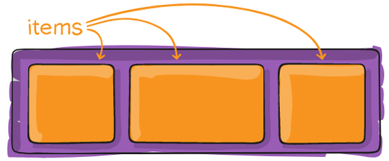
Hiện có hai thành phần chính trong Flexbox:
- Flex container
- Flex Items
Lưu ý: Flexbox Layout phù hợp nhất để thiết lập bố cục ở quy mô nhỏ, còn thiết lập bố cục với phạm vi lớn hơn thì vẫn nên sử dụng kiểu thông thường là dàn trang theo dạng lưới (grid layout).
Các khái niệm cơ bản và thuật ngữ
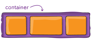
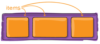
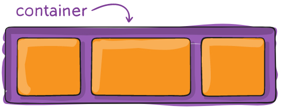
Bố cục Flex được thiết lập từ một khung lớn (parent container) đóng vai trò là khung linh hoạt (flex containter) và các thẻ con ngay trong nó (immediate children) đóng vai trò các mục nhỏ linh hoạt (flex item).
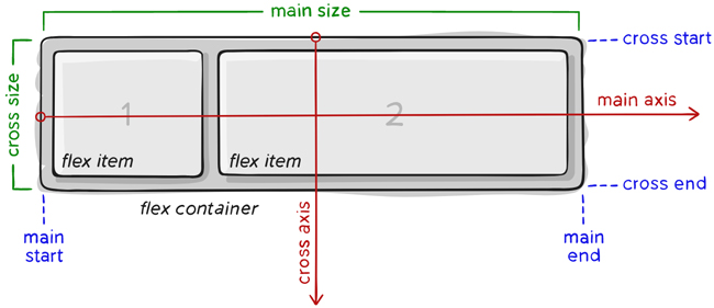
Dưới đây là sơ đồ cấu trúc Flexbox:
Thành phần quan trọng nhất của Flexbox là
- container: là thành phần lớn bao quanh các phần tử bên trong, các item bên trong sẽ hiển thị dựa trên thiết lập của container này.
- item: là phần tử con của container, bạn có thể thiết lập nó sẽ sử dụng bao nhiêu cột trong một container, hoặc thiết lập thứ tự hiển thị của nó.
 |
 |
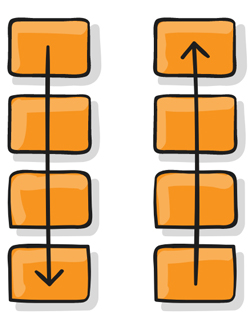
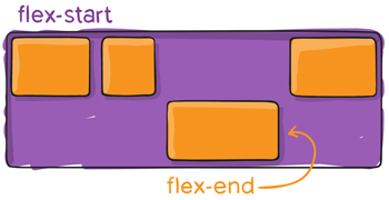
Các item sẽ được bố trí theo trục main axis (bắt đầu từ main-start, kết thúc ở main-end) hoặc theo trục cross axis (bắt đầu từ cross-start, kết thúc ở cross-end).
- main axis: đây là trục chính để điều khiển hướng mà các item sẽ hiển thị. Lưu ý, main axis không phải lúc nào cũng nằm ngang như sơ đồ trên, bạn có thể sử dụng thuộc tính flex-direction để thay đổi hướng của trục và lúc đó các item sẽ hiển thị theo nó.
- main-start | main-end: khi thiết lập flexbox, các item nằm trong container hiển thị từ điểm bắt đầu gọi là main-start tới điểm kết thúc gọi là main-end.
- main size: kích thước (chiều rộng hoặc chiều cao) của các item, tùy thuộc vào hướng của main axis.
- cross axis: cross axis luôn là trục vuông góc của main axis. Hướng của nó phụ thuộc vào hướng của main axis.
- cross-start | cross-end: có ý nghĩa tương tự nhưng luôn vuông góc với main start, main end.
- cross size: kích thước (chiều rộng hoặc chiều cao) của các item dựa trên trục cross axis, tùy thuộc vào hướng của main axis.
Các thuộc tính của Flex Container
display
Để sử dụng flex trong css thì đơn giản là chúng ta chỉ cần khai báo thuộc tính display: flex
.container { display: flex; /* hoặc inline-flex */}
Lưu ý: các cột CSS thông thường không sử dụng được trong flex container.
flex-direction
Thuộc tính flex-direction xác định hướng của main-axis để container sắp xếp các item.
 |
 |
Cú pháp:
.container { flex-direction: row | row-reverse | column | column-reverse; }
Các tham số:
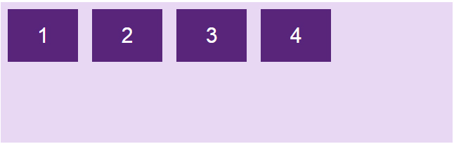
- row: mặc định, flex item được sắp xếp theo chiều ngang, từ trái qua phải (main axis nằm ngang).
- row-reverse: flex item được sắp xếp theo chiều ngang, từ phải qua trái (main axis nằm ngang).
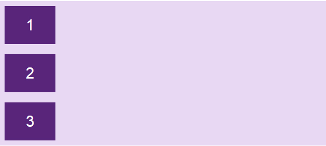
- column: flex item được sắp xếp theo chiều dọc, từ trên xuống dưới (main axis đứng dọc).
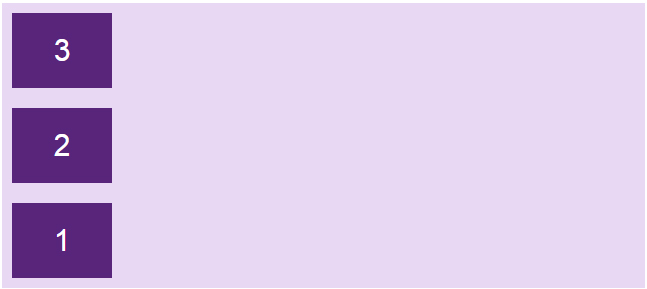
- column-reverse: flex item được sắp xếp theo chiều dọc, từ dưới lên trên (main axis đứng dọc).
Ví dụ:
.flex-container { display: flex; flex-direction: row;}
|
 |
.flex-container { display: flex; flex-direction: row-reverse;}
|
 |
.flex-container { display: flex; flex-direction: column;}
|
 |
.flex-container { display: flex; flex-direction: column-reverse;}
|
 |
Code đầy đủ:
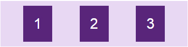
<!DOCTYPE html><html><head><style>.flex-container { display: flex; flex-direction: column; background-color: #e9d8f4;}.flex-container > div { background-color: #58257b; width: 100px; margin: 10px; color: white; text-align: center; line-height: 75px; font-size: 30px;}</style></head><body><h1>Thuộc tính flex-direction</h1><div class="flex-container"> <div>1</div> <div>2</div> <div>3</div> </div></body></html>
flex-wrap

Theo mặc định, item sẽ tự động thay đổi kích thước phần tử để nó luôn hiển thị trên cùng một dòng dù bạn có resize trình duyệt theo kích thước nào, điều này dễ làm cho nội dung bên trong (nếu có) bị giãn hay ép nhỏ lại, có thể gây xấu giao diện.
Vì vậy, ta có thuộc tính flex-wrap cho phép item tự động xuống dòng khi kích thước container thay đổi.
Cú pháp:
.container{ flex-wrap: nowrap | wrap | wrap-reverse; }
Tham số:
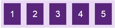
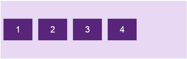
- nowrap: mặc định, tất cả các item sẽ nằm trên một dòng.
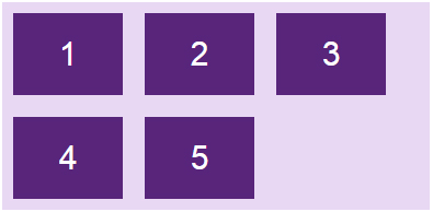
- wrap: khi kích thước container thay đổi và tổng chiều rộng các item cộng lại lớn hơn chiều rộng của container thì item sẽ tự động xuống dòng.
- wrap-reverse: tương tự như wrap, nhưng thay vì xuống dòng thì item sẽ tự động nhảy lên trên.
Ví dụ:
.flex-container { display: flex; flex-wrap: nowrap;}
|
 |
.flex-container { display: flex; flex-wrap: wrap;}
|
 |
.flex-container { display: flex; flex-wrap: wrap-reverse;}
|
 |
Chạy code sau rồi thử resize trình duyệt để thấy rõ hơn sự khác biệt nhé:
<!DOCTYPE html><html><head><style>.flex-container { display: flex; flex-wrap: wrap-reverse; background-color: #e9d8f4;}.flex-container > div { background-color: #58257b; width: 100px; margin: 10px; color: white; text-align: center; line-height: 75px; font-size: 30px;}</style></head><body><h1>Thuộc tính flex-wrap</h1><div class="flex-container"> <div>1</div> <div>2</div> <div>3</div> <div>4</div> <div>5</div> </div></body></html>
flex-flow
Thuộc tính flex-flow sử dụng để gộp chung hai thuộc tính flex-direction và flex-wrap.
Cú pháp:
flex-flow: <'flex-direction'> || <'flex-wrap'>
Ví dụ:
.flex-container { display: flex; flex-flow: row wrap;}
justify-content
 |
 |
 |
 |
 |
 |
Theo mặc định, các item bên trong sẽ bắt đầu từ main start đến main end, tuy nhiên, đôi khi container vẫn còn khoảng trống. Vì vậy, bạn có thể sử dụng thuộc tính justify-content để điều chỉnh vị trí bắt đầu và căn chỉnh các item bên trong container theo dọc theo trục main axis, chiều ngang hoặc chiều dọc tùy thuộc vào flex-direction.
Cú pháp:
.container { justify-content: flex-start | flex-end | center | space-between | space-around | space-evenly; }
Các tham số:
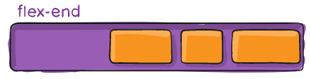
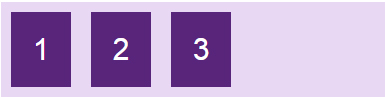
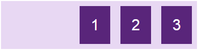
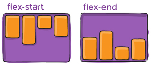
- flex-start: giá trị mặc định, item sẽ bắt đầu từ lề chính main-start của container.
- flex-end: item sẽ bắt đầu từ lề chính main-end của container (khác với row-reverse là đổi hướng hiển thị).
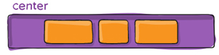
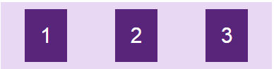
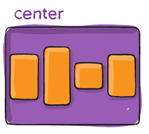
- center: item sẽ nằm giữa container.
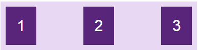
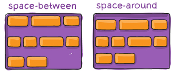
- space-between: các item sẽ có khoảng cách giữa các phần tử bằng nhau do container sẽ tự động căn khoảng cách, item đầu tiên sát lề chứa điểm main-start, item cuối cùng sát lề chứa điểm main-end.
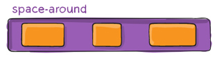
- space-around: tương tự space-between, nhưng khác ở chỗ là mỗi item có khoảng cách 2 bên cạnh và những khoảng cách này bằng nhau.
- space-evenly: các item được phân phối sao cho khoảng cách giữa hai item bất kỳ, giữa item và các lề là bằng nhau.
Ví dụ: Ở đây main axis nằm ngang
.flex-container { display: flex; justify-content: flex-start;}
|
 |
.flex-container { display: flex; justify-content: flex-end;}
|
 |
.flex-container { display: flex; justify-content: center;}
|
 |
.flex-container { display: flex; justify-content: space-between;}
|
 |
.flex-container { display: flex; justify-content: space-evenly;}
|
 |
.flex-container { display: flex; justify-content: space-around;}
|
 |
Thay các giá trị vào code để thấy sự khác biệt nhé:
<!DOCTYPE html><html><head><style>.flex-container { display: flex; justify-content: space-evenly; background-color: #e9d8f4;}.flex-container > div { background-color: #58257b; width: 60px; margin: 10px; color: white; text-align: center; line-height: 75px; font-size: 30px;}</style></head><body><h1>Thuộc tính justify-content</h1><div class="flex-container"> <div>1</div> <div>2</div> <div>3</div> </div></body></html>
align-items
 |
 |
|
 |
Thuộc tính align-items sử dụng để điều chỉnh vị trí bắt đầu và căn chỉnh các item bên trong container theo dọc theo trục cross axis, chiều ngang hoặc chiều dọc tùy thuộc vào flex-direction.
Cú pháp:
.container { align-items: stretch | flex-start | flex-end | center | baseline; }
Các tham số và ví dụ minh họa
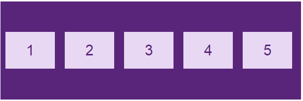
stretch: giá trị mặc định, các phần tử sẽ được kéo dài để lấp đầy container chứa nó, nhưng sẽ ưu tiên giá trị height/width nếu có, khi đó item sẽ không cao full mà chỉ lấy giá trị height/width mà bạn set.
.flex-container { display: flex; align-items: stretch;}

flex-start: item sẽ bắt đầu từ lề cross-start của container.
Ví dụ trường hợp mặc định với main axis nằm ngang, cross axis đứng dọc, flex-direction: row thì các item sẽ bắt đầu từ trên.
.flex-container { display: flex; align-items: flex-start;}
flex-end: item sẽ bắt đầu từ lề cross-end của container. Trường hợp mặc định với cross axis đứng dọc, flex-direction: row thì các item sẽ dồn xuống dưới.
.flex-container { display: flex; align-items: flex-end;}

center: item sẽ căn giữa theo chiều của cross axis.
.flex-container { display: flex; align-items: center;}
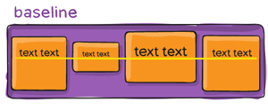
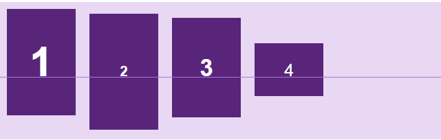
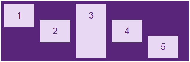
baseline: item được căn chỉnh theo đường cơ sở của chúng.
Đường cơ sở là đường mà tất cả các chữ cái sẽ "ngồi lên". Bạn có thể sử dụng kích thước font chữ khác nhau để thấy rằng các mục được căn chỉnh theo đường cơ sở baseline:
.flex-container { display: flex; align-items: baseline;}
Code đầy đủ, thay các giá trị để thấy rõ hơn.
<!DOCTYPE html><html><head><style>body { font-family: arial; }.flex-container { display: flex; height: 200px; align-items: center; background-color: #e9d8f4;}.flex-container > div { background-color: #58257b; width: 100px; margin: 10px; color: white; text-align: center; line-height: 75px; font-size: 30px;}</style></head><body><h1>Thuộc tính align-items</h1><div class="flex-container"> <div>1</div> <div>2</div> <div>3</div> <div>4</div> </div></body></html>
align-content
 |
 |
 |
 |
Thuộc tính align-content sử dụng để căn chỉnh khoảng cách các item bên trong container theo dọc theo trục cross axis, chiều ngang hoặc chiều dọc tùy thuộc vào flex-direction.
Cú pháp:
.container { align-content: flex-start | flex-end | center | space-between | space-around | stretch; }
Các tham số:
|
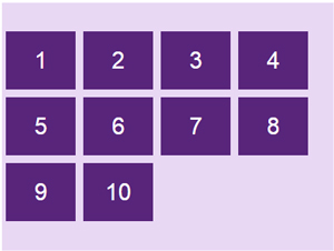
flex-start: item sẽ bắt đầu từ lề chứa cross-start của container.
.flex-container { display: flex; flex-wrap: wrap; align-content: flex-start;}
|
 |
|
flex-end: item sẽ bắt đầu từ lề chứa cross-end của container.
.flex-container { display: flex; flex-wrap: wrap; align-content: flex-end;}
|
 |
|
center: item sẽ nằm giữa container căn theo cross-axis.
.flex-container { display: flex; flex-wrap: wrap; align-content: center;}
|
 |
|
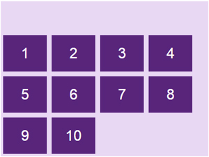
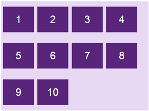
space-between: các item sẽ có khoảng cách giữa các phần tử bằng nhau do container tự động căn khoảng cách, item đầu tiên sát lề chứa cross-start, item cuối cùng sát lề chứa cross-end.
.flex-container { display: flex; flex-wrap: wrap; align-content: space-between;}
|
 |
|
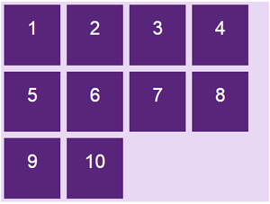
space-around: tương tự space-between, nhưng khác ở chỗ là mỗi item có khoảng cách 2 bên cạnh và những khoảng cách này bằng nhau.
.flex-container { display: flex; flex-wrap: wrap; align-content: space-around;}
|
 |
|
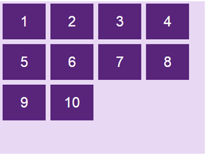
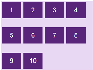
stretch: giá trị mặc định, các phần tử sẽ được kéo dài, căn chỉnh sao cho lấp đầy container chứa nó (vẫn ưu tiên giá trị height/width nếu có).
.flex-container { display: flex; flex-wrap: wrap; align-content: stretch;}
|
 |
Code đầy đủ:
<!DOCTYPE html><html><head><style>.flex-container { display: flex; height: 320px; flex-wrap: wrap; align-content: stretch; background-color: #e9d8f4;}.flex-container > div { background-color: #58257b; width: 90px; margin: 5px; color: white; text-align: center; line-height: 75px; font-size: 30px;}</style></head><body><h1>Thuộc tính align-content</h1><div class="flex-container"> <div>1</div> <div>2</div> <div>3</div> <div>4</div> <div>5</div> <div>6</div> <div>7</div> <div>8</div> <div>9</div> <div>10</div></div></body></html>
Các thuộc tính của Flex Item
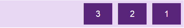
order
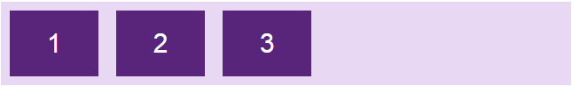
Theo mặc định, các item sẽ hiển thị theo thứ tự xuất hiện trong HTML, nhưng với thuộc tính order, bạn có thể sắp xếp lại vị trí sắp xếp của các item.

Cú pháp:
.item { order: <integer>; /* mặc định là 0 */ }
Ví dụ:
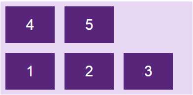
<div class="flex-container"> <div style="order: 3">1</div> <div style="order: 2">2</div> <div style="order: 4">3</div> <div style="order: 1">4</div></div>

flex-grow
Thuộc tính flex-grow cho phép các phần tử giãn theo độ rộng của container.
Cú pháp:
.item { flex-grow: <number>; /* mặc định là 0 */ }
Thuộc tính này hơi phức tạp, Quantrimang sẽ minh họa một số trường hợp hay gặp cho bạn dễ hình dung hơn. Ví dụ ta set các item có độ rộng là 100px.

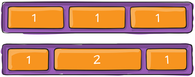
Giá trị mặc định của thuộc tính flex-grow là 0, các item sẽ không tự động co giãn kích thước, để lại nhiều khoảng trống trong container.
Khi ta tăng flex-grow = 1, item sẽ tự động giãn ra đều nhau sao cho vừa với khung container.
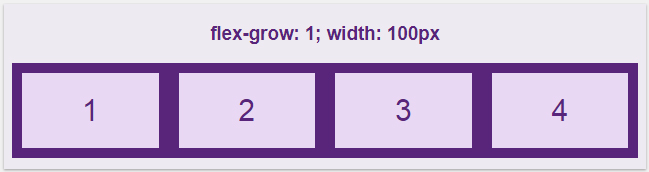
Giá trị của flex-grow rất linh động, khi set thuộc tính này cho tất cả các item với cùng một giá trị thì các item sẽ có tỉ lệ như nhau và được dàn đều lấp đầy container. Ví dụ set tất cả các phần tử flex-grow là 1 thì tất cả đều như nhau tỉ lệ 1:1, mà set flex-grow là 100 thì kết qua vẫn sẽ ra tương tự với tỉ lệ 1:1.
Nhưng điều thú vị hơn ở flex-grow là áp dụng nó cho từng item. Ta có giá trị mặc định ở tất cả phần tử là flex-grow = 0, thay đổi riêng giá trị của item2 thành 1, kết quả như sau:
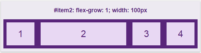
Vậy là ở đây, thiết lập flex-grow là 1 thì item2 sẽ lấy phần trống còn lại của container đắp vào chính nó.
Bây giờ hãy thử cho các phần tử đều là flex-grow: 1, nhưng set riêng phần tử thứ 3 giá trị khác:
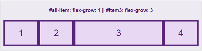
Lúc này thì tất cả các item đều được giãn ra lấp đầy phần trống của container, nhưng item3 có flex-grow: 3 sẽ được thừa hưởng nhiều phần trống hơn các item còn lại chỉ có flex-grow: 1, cụ thể là hơn khoảng 3 lần. Và như đã đề cập ở trên, thuộc tính flex-grow làm cho các phần tử tỉ lệ với nhau. Giả sử các item đều có flex-grow: 4 và item3 có thuộc tính flex-grow: 12 thì nó cũng tương tự như là 1 với 3.
Bạn tự thay đổi các giá trị để hiểu rõ hơn nhé.
<!DOCTYPE html><html><head><style>.flex-container { display: flex; align-items: stretch; background-color: #58257b;}.flex-container>div { background-color: #e9d8f4; color: #58257b; margin: 5px; text-align: center; line-height: 75px; font-size: 30px;}</style></head><body><h4 style="text-align: center;">#all-item: flex-grow:1|#item3: flex-grow:3</h4><div class="flex-container"> <div style="flex-grow: 1">1</div> <div style="flex-grow: 1">2</div> <div style="flex-grow: 3">3</div> <div style="flex-grow: 1">4</div></div></body></html>
flex-shrink
Thuộc tính flex-shrink ngược lại với thuộc tính flex-grow ở trên, nó không giãn ra mà lại co lại khi chúng ta thay đổi độ rộng của container.
Cú pháp:
.item { flex-shrink: <number>; /* mặc định là 1 */ }
Giá trị mặc định trong flex-shrink là 1, cho phép các phần tử co lại bằng nhau khi độ rộng container giảm xuống. Nếu flex-shrink: 0 thì item sẽ không co giãn mà lấy nguyên giá trị của thuộc tính width/height.
Nếu muốn item3 nó co lại nhiều hơn so với các item khác thì tăng giá trị flex-shrink của nó lên.
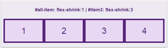
Resize cửa sổ trình duyệt nhỏ lại thì item3 co lại nhiều hơn:
flex-basis
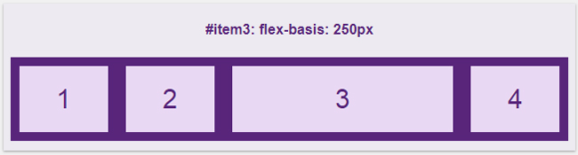
Thuộc tính flex-basis sử dụng để xác định độ dài ban đầu của một item.
Cú pháp:
.item { flex-basis: <length> | auto; /* mặc định là auto */ }
Nếu bạn xác định độ dài chung của class item là 100px nhưng tùy chỉnh item3 với flex-basis: 250px thì ta sẽ được như sau:
flex
Thuộc tính flex sử dụng để gộp chung ba thuộc tính flex-grow, flex-shrink và flex-basis.
Cú pháp:
.item { flex: none | [ <'flex-grow'> <'flex-shrink'> || <'flex-basis'> ] }
Thay vì phải sử dụng cả 3 thuộc tính:
.item { flex-grow: 1; flex-shrink: 3; flex-basis: 250px; }
Thì bạn có thể sử dụng thuộc tính flex một cách ngắn gọn:
flex: 1 3 250px;
Giá trị mặc định của flex là:
flex: 0 1 auto;
Lưu ý:
- Nếu thuộc tính chỉ có một tham số thế này: flex: 1; thì ta hiểu đó là flex-grow.
- Nếu thuộc tính chỉ có một tham số có đơn vị độ dài như thế này: flex: 250px; thì ta hiểu đó là flex-basis.
- Nếu thuộc tính có hai tham số thế này: flex: 1 250px; thì ta hiểu đó là flex-grow và flex-basis.
- Nếu thuộc tính có hai tham số thế này: flex: 1 2; thì ta hiểu đó là flex-grow và flex-shrink.
align-self
Thuộc tính align-self có tác dụng tương tự như align-items của phần container nhưng sử dụng riêng cho từng item, bạn có thể dùng nó để đặt lại vị trí cho một số item mà align-items đã quy định.
.item { align-self: auto | flex-start | flex-end | center | baseline | stretch; }
Align-self cũng có các giá trị giống như align-items đó là: flex-start, flex-end, center, stretch và baseline.
Ví dụ: Ta có 5 item đã được căn ra giữa nhờ align-items:center như sau:
Bạn có thể căn chỉnh các item theo ý thích, item1 nằm ở trên cùng, item3 thì phải kéo giãn dài ra và item5 thì phải nằm dưới cùng, hãy dùng align-self để đặt lại các vị trí.
<div class="flex-container"> <div style="align-self: flex-start">1</div> <div>2</div> <div style="align-self: stretch">3</div> <div>4</div> <div style="align-self: flex-end">5</div></div>
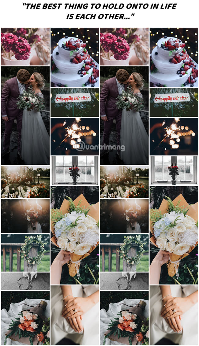
Tạo thư viện ảnh sử dụng Flexbox
Sử dụng flexbox để tạo một bộ sưu tập ảnh hiển thị bố cục khác nhau tùy thuộc vào kích thước màn hình:
Bạn tự chạy code, resize màn hình để xem kết quả nhé:
<!DOCTYPE html><html><style>* { box-sizing: border-box;}body { margin: 0; font-family: Arial;}.header { text-align: center; padding: 32px;}.row { display: flex; flex-wrap: wrap; padding: 0 4px;}/* Tạo bốn cột bằng nhau nằm cạnh nhau */.column { flex: 25%; max-width: 25%; padding: 0 4px;}.column img { margin-top: 8px; vertical-align: middle;}/* Bố cục linh hoạt: tạo bố cục 2 cột */@media (max-width: 800px) {.column { flex: 50%; max-width: 50%;}}/* Bố cục linh hoạt: làm cho hai cột xếp chồng lên nhau thay vì cạnh nhau */@media (max-width: 600px) {.column { flex: 100%; max-width: 100%;}}</style><body><!-- Header --><div class="header"><h1>Responsive Image Grid</h1><p>Resize the browser window to see the responsive effect.</p></div><!-- Photo Grid --><div class="row"> <div class="column"> <img src="flower-1.jpg" style="width:100%"> <img src="wedding-1.jpg" style="width:100%"> <img src="flower-2.jpg" style="width:100%"> <img src="wedding-2.jpg" style="width:100%"> <img src="flower-3.jpg" style="width:100%"> <img src="wedding-3.jpg" style="width:100%"> <img src="flower-4.jpg" style="width:100%"> </div> <div class="column"> <img src="wedding-cake.jpg" style="width:100%"> <img src="wedding-4.jpg" style="width:100%"> <img src="wedding-5.jpg" style="width:100%"> <img src="flower-5.jpg" style="width:100%"> <img src="flower-6.jpg" style="width:100%"> <img src="wedding-6.jpg" style="width:100%"> </div> <div class="column"> <img src="flower-1.jpg" style="width:100%"> <img src="wedding-1.jpg" style="width:100%"> <img src="flower-2.jpg" style="width:100%"> <img src="wedding-2.jpg" style="width:100%"> <img src="flower-3.jpg" style="width:100%"> <img src="wedding-3.jpg" style="width:100%"> <img src="flower-4.jpg" style="width:100%"> </div> <div class="column"> <img src="wedding-cake.jpg" style="width:100%"> <img src="wedding-4.jpg" style="width:100%"> <img src="wedding-5.jpg" style="width:100%"> <img src="flower-5.jpg" style="width:100%"> <img src="flower-6.jpg" style="width:100%"> <img src="wedding-6.jpg" style="width:100%"> </div></div></body></html>
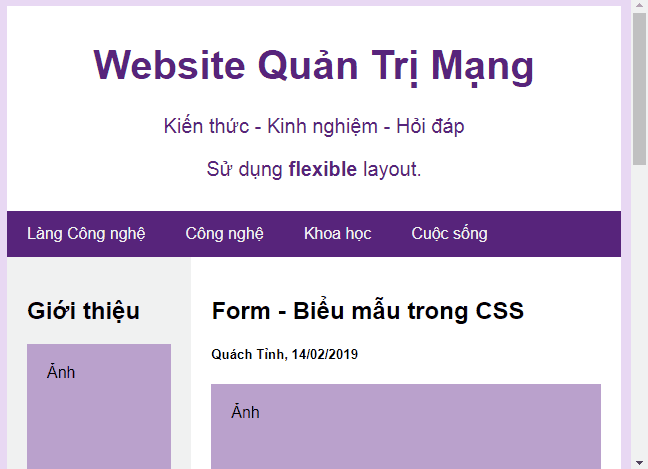
Flexbox Layout website kiểu mẫu
<!DOCTYPE html><html><head><title>Page Title</title><meta charset="UTF-8"><meta name="viewport" content="width=device-width, initial-scale=1"><style>* { box-sizing: border-box;}/* Style the body */body { font-family: Arial; padding: 10px; background: #e9d8f4; margin: 0;}/* Header/logo Title */.header { padding: 10px; text-align: center; background: white; color: #58257b;}.header h1 { font-size: 40px;}.header p { font-size: 20px;}/* Định dạng navigation bar */.navbar { display: flex; background-color: #58257b;}/* Định dạng link điều hướng */.navbar a { color: #f2f2f2; padding: 14px 20px; text-decoration: none; text-align: center;}/* Thay đổi màu liên kết khi di chuột qua */.navbar a:hover { background-color: #db7093; color: white;}/* Column container */.row { display: flex; flex-wrap: wrap;}/* Tạo hai cột không bằng nhau nằm cạnh nhau *//* Sidebar/Cột trái */.side { flex: 30%; background-color: #f1f1f1; padding: 20px;}/* Cột chính */.main { flex: 70%; background-color: white; padding: 20px;}/* Hình ảnh tượng trưng */.fakeimg { background-color: #baa1cc; width: 100%; padding: 20px;}/* Footer */.footer { padding: 10px; text-align: center; background: white; margin-top: 10px;}/* Bố cục linh hoạt: các cột xếp chồng lên nhau thay vì cạnh nhau khi màn hình có chiều rộng dưới 600px */@media screen and (max-width: 600px) { .row, .navbar { flex-direction: column;}}</style></head><body><!-- Header --><div class="header"> <h1>Website Quản Trị Mạng</h1> <p>Kiến thức - Kinh nghiệm - Hỏi đáp</p> <p>Sử dụng <b>flexible</b> layout.</p></div><!-- Navigation Bar --><div class="navbar"> <a href="#">Làng Công nghệ</a> <a href="#">Công nghệ</a> <a href="#">Khoa học</a> <a href="#">Cuộc sống</a></div><!-- Nội dung --><div class="row"> <div class="side"> <h2>Giới thiệu</h2> <div class="fakeimg" style="height:200px;">Ảnh</div> <p>Quantrimang.com là mạng xã hội về khoa học công nghệ.</p> <h3>Nổi bật</h3> <div class="fakeimg" style="height:60px;">Ảnh</div><br> <div class="fakeimg" style="height:60px;">Ảnh</div><br> <div class="fakeimg" style="height:60px;">Ảnh</div> <h3>Follow Me</h3> <p>Facebook</p> <p>YouTube</p> </div> <div class="main"> <h2>Form - Biểu mẫu trong CSS</h2> <h5>Quách Tỉnh, 14/02/2019</h5> <div class="fakeimg" style="height:200px;">Ảnh</div> <p>Form là một phần không thể thiếu trong bất kì loại website nào.</p> <p>Ở bài viết này, Quantrimang.com sẽ hướng dẫn bạn cách xây dựng phần giao diện hiển thị của một biểu mẫu cơ bản. Giao diện này có thể được làm khá đẹp mắt với CSS</p> <br> <h2>Attribute Selector trong CSS</h2> <h5>Quách Tỉnh, 14/02/2019</h5> <div class="fakeimg" style="height:200px;">Ảnh</div> <p>Attribute selector là cách chọn các phần tử bạn muốn định kiểu trong tài liệu HTML dựa vào thuộc tính của một hay nhiều thẻ HTML nào đó.</p> <p>Attribute selector có thể chọn được các đối tượng mà không cần phải khai báo thêm các Class hoặc ID vào trong thẻ HTML và vẫn có thể hướng được đến các thành phần đó, giúp code gọn gàng hơn và mạch lạc hơn.</p> </div></div><!-- Footer --><div class="footer"> <h4>Giấy phép số 362/GP-BTTTT. Bộ TT&TT cấp ngày 30/06/2016.</h4></div></body></html>
